10 Website User Experience Best Practices
In a crowded online space, a seamless user experience is the foundation of digital success. A visitor decides within seconds whether your site is worth their time, and that judgment is based almost entirely on the experience you provide. Poor navigation, slow load times, or confusing design elements don't just frustrate users; they actively drive potential customers to your competitors. A well-crafted website experience, on the other hand, builds trust and guides visitors effortlessly toward their goals.
This guide moves beyond generic advice to deliver 10 essential website user experience best practices designed for immediate impact. We will provide actionable strategies, specific implementation details, and practical examples to help you optimize every aspect of your site. You will learn how to build a website that not only looks great but performs flawlessly. From clear navigation and mobile-first design to intuitive forms and accessibility, these proven techniques will help you transform casual visitors into loyal customers, driving engagement and boosting your bottom line. Let's dive into the practices that create a powerful and lasting advantage.
1. Clear and Intuitive Navigation
If users can't find what they're looking for, your website has failed its primary purpose. Clear and intuitive navigation acts as a reliable roadmap, guiding visitors to their destination with minimal effort. This foundational principle, championed by experts like Steve Krug in his book Don't Make Me Think, is a cornerstone of website user experience best practices. The goal is simple: ensure a user can locate any key piece of information within three clicks.
A well-structured navigation system reduces bounce rates, increases session duration, and directly boosts user satisfaction and conversions. Think of Apple’s website: its minimalist top bar presents only the most essential product categories, preventing overwhelm and guiding users effectively. Similarly, Airbnb uses a simple primary navigation focused on its core service, paired with a powerful, prominent search bar.
How to Implement Clear Navigation
To improve your site's usability, focus on structure and clarity. Start by organizing your content into logical groups that reflect how your users think, not how your company is structured.
- Limit Menu Items: Keep your main navigation menu concise, ideally with 5-7 top-level options. This prevents choice paralysis.
- Use Descriptive Labels: Avoid vague terms like "Services" or "Products." Instead, use clear labels that tell users exactly what they will find, such as "Web Design Services" or "Men's Running Shoes."
- Implement a Sticky Header: For pages with significant scrolling, a sticky (or fixed) navigation header keeps the menu visible at all times, making it easy for users to move to another section without scrolling back to the top.
- Prioritize Mobile: Ensure your mobile navigation menu is thumb-friendly, with large, easily tappable targets. A "hamburger" menu is a common solution, but critical links should remain visible if possible.
2. Fast Page Load Speed
In an age of instant gratification, a slow website is a user experience deal-breaker. Website performance is critical, as slow loading times significantly increase bounce rates and harm conversions. This principle, heavily emphasized by Google through its Core Web Vitals initiative, is a non-negotiable component of modern website user experience best practices. The ideal goal is to have your pages load in under three seconds to keep users engaged.
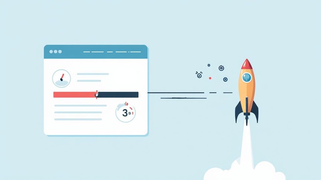
The impact of speed on the bottom line is well-documented. Amazon famously reported a 1% revenue loss for every 100ms of delay, while Walmart saw a 2% increase in conversions for every one-second improvement in load time. These figures prove that investing in performance delivers tangible returns by reducing user frustration and improving your site's search engine ranking.
How to Implement Fast Page Load Speed
To boost your site’s performance, focus on technical optimizations that reduce the time it takes for your content to render. Start by analyzing your current speed with tools like Google PageSpeed Insights or GTmetrix to identify bottlenecks.
- Optimize Images: Compress images and serve them in modern formats like WebP to drastically reduce file sizes without sacrificing quality.
- Leverage a CDN: Use a Content Delivery Network (CDN) like Cloudflare or Akamai to store copies of your site on servers worldwide, delivering content faster to users based on their geographic location.
- Enable Caching and Compression: Implement browser caching and use GZIP compression on your server to reduce the size of your files and the number of requests.
- Minimize Third-Party Scripts: Audit and remove unnecessary third-party scripts, such as tracking codes or plugins, as they can significantly slow down your site. For an in-depth look at optimizing your site, explore these top tips for faster website speed.
3. Mobile-First Responsive Design
With mobile devices now accounting for the majority of global web traffic, designing for the smallest screen first is no longer an option; it's a necessity. Mobile-first responsive design flips the traditional desktop-to-mobile workflow, forcing you to prioritize core content and functionality. This approach, championed by Luke Wroblewski, is a fundamental aspect of modern website user experience best practices that ensures a seamless experience for every user, regardless of their device.
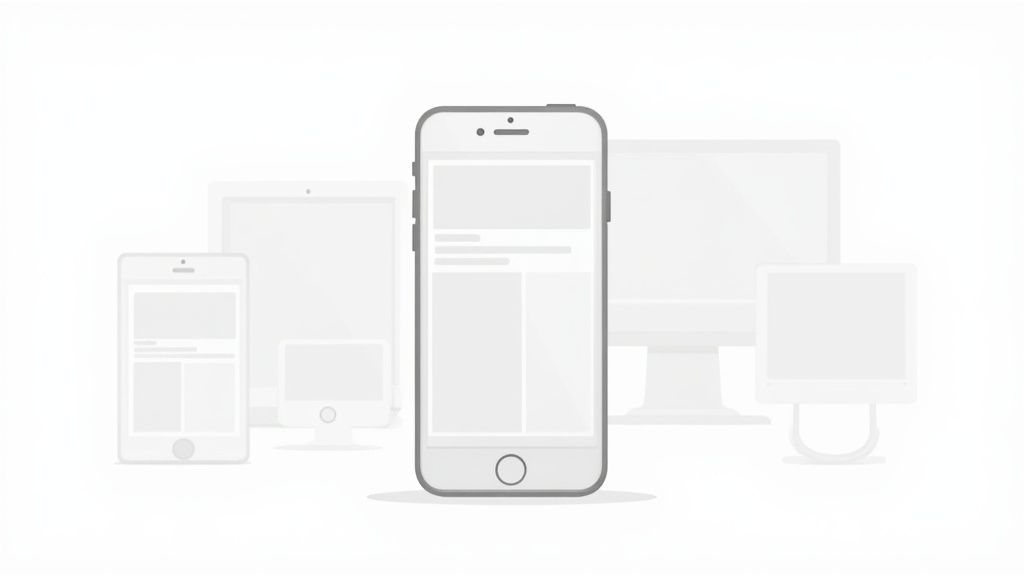
This methodology directly addresses Google's mobile-first indexing, which prioritizes the mobile version of a site for ranking. It leads to faster load times and a cleaner, more focused user interface. For example, Medium's article layouts are perfectly fluid, offering an exceptional reading experience on a phone that gracefully expands to larger screens. Similarly, Spotify's web player feels like a native app on mobile, demonstrating how a mobile-first mindset can create a consistent and intuitive experience across platforms.
How to Implement Mobile-First Design
Adopting a mobile-first strategy means building your design from the ground up for mobile constraints, then progressively enhancing it for tablets and desktops. This ensures the core experience is solid on all devices.
- Design for Smallest Screens First: Start your design process with the mobile viewport. This forces you to focus on essential content and actions, eliminating clutter.
- Use Flexible Grids and Units: Build layouts using relative units like percentages (%), ems, or rems instead of fixed pixels. This allows your design to fluidly adapt to different screen sizes.
- Ensure Large Touch Targets: Make all interactive elements, like buttons and links, at least 44x44 pixels. This prevents user frustration from accidental taps on smaller screens.
- Test on Real Devices: While browser emulators are useful, nothing beats testing on actual smartphones and tablets. This helps you catch performance issues and interaction quirks you might otherwise miss.
4. Clear Call-to-Action (CTA) Buttons
A Call-to-Action (CTA) is the gateway to conversion. It tells users exactly what you want them to do next, whether it's signing up, making a purchase, or learning more. Without a clear and compelling CTA, even the most interested visitors will get lost, which is why optimizing them is a critical component of website user experience best practices. The goal is to make the desired action the most obvious and easiest step for the user to take.

Effective CTAs directly guide the user journey, reduce friction, and boost conversion rates. Think of HubSpot's iconic orange "Get Started Free" buttons, which stand out on every page, or Netflix’s high-contrast sign-up CTAs that make joining effortless. These examples work because they are visually prominent, use action-oriented language, and are placed exactly where the user is most likely to act. For more information, explore these conversion optimization tips.
How to Implement Clear CTAs
To design CTAs that convert, focus on visibility, value, and clarity. Your button should stand out from its surroundings and clearly communicate the benefit of clicking.
- Use Action-Oriented Language: Instead of generic words like "Submit," use specific, first-person verbs that convey value. "Start My Free Trial" is far more compelling than "Begin Trial."
- Create Visual Contrast: Your CTA button should use a color that contrasts with the background and surrounding elements, making it impossible to miss.
- Strategic Placement: Place your primary CTA above the fold where it is immediately visible. Include secondary CTAs with a less dominant design for users who aren't ready to commit.
- Optimize for Size and Space: Ensure buttons are large enough to be easily clicked or tapped, especially on mobile devices. Use whitespace around the CTA to make it stand out.
5. Readable and Scannable Content
Users rarely read websites word-for-word; instead, they scan for key information. This behavior, extensively researched by usability expert Jakob Nielsen, highlights the need for scannable content. Organizing your text for quick consumption is a crucial aspect of website user experience best practices because it respects the user’s time and helps them find answers quickly. The goal is to make your content digestible at a glance, allowing visitors to absorb the main points without reading every sentence.
Well-structured content improves comprehension, reduces cognitive load, and keeps users engaged. Think of Medium’s minimalist article layout, which uses ample whitespace, clear headings, and short paragraphs to create an effortless reading experience. Similarly, Buffer’s blog posts break down complex marketing topics into scannable sections with bolded key phrases and bullet points, making their advice easy to follow and implement. This approach ensures your message gets across effectively.
How to Create Scannable Content
To make your content more readable, focus on visual hierarchy and clear writing. Structure your pages to guide the user’s eye through the most important information first, following the inverted pyramid model where the conclusion is presented at the beginning.
- Use Descriptive Headings: Create a clear hierarchy with H2s and H3s that accurately describe the content in each section. This helps both users and search engines understand your page structure.
- Keep Paragraphs Short: Limit paragraphs to just two or three sentences. This creates more whitespace and makes the text feel less intimidating.
- Leverage Lists: Use bullet points or numbered lists to break up dense information and highlight key steps, features, or benefits.
- Prioritize Typography: Choose a clean, legible font and use a body text size of at least 16px. Ensure sufficient line height (around 1.5 times the font size) to improve readability.
6. Consistent Visual Design and Branding
A website that changes its look and feel from page to page creates confusion and erodes trust. Consistent visual design and branding act as the glue that holds your user experience together, making your site feel predictable, professional, and reliable. This principle, popularized by design system pioneers like Google and Brad Frost’s Atomic Design methodology, is fundamental to creating a seamless journey and is a critical component of website user experience best practices.
When users know what to expect from your interface, they can focus on their goals instead of re-learning how to interact with your site on every new page. Think of Google's suite of products; the consistent use of Material Design makes transitioning between Gmail, Drive, and Calendar feel effortless. Similarly, Airbnb’s cohesive design language ensures the experience is familiar and intuitive, whether a user is booking a stay or browsing experiences. This consistency reinforces brand identity and makes navigation second nature.
How to Implement Consistent Design
To build a cohesive user experience, establish and adhere to a set of design standards that govern your entire digital presence. This system ensures every element feels like part of a unified whole.
- Create a Brand Style Guide: Document your brand’s official colors, typography, logo usage, and spacing rules. This guide serves as the single source of truth for all design decisions.
- Develop Reusable Components: Build a library of UI elements like buttons, forms, and cards that can be reused across the site. This not only ensures consistency but also speeds up development.
- Establish a Grid System: Use a consistent grid, typically a 12-column layout, to align elements and create a visually organized and balanced structure on every page.
- Use CSS Variables: Define your core colors, fonts, and spacing as CSS variables. This makes it easy to apply and update styles globally, ensuring any changes are reflected everywhere at once.
7. Effective Error Handling and Feedback
Mistakes happen, but how a website responds to them defines the user experience. Effective error handling turns moments of frustration into opportunities for guidance. Instead of a generic "Error," a great website offers clear, helpful messages that explain the problem and how to fix it. This principle, a key part of website user experience best practices, is crucial for maintaining user trust and preventing them from abandoning a task.
Graceful error handling reduces friction and keeps users engaged. Mailchimp is famous for its friendly error states, which use conversational language to explain what went wrong without blaming the user. Similarly, Slack uses gentle humor and clear instructions to guide users back on track. Providing positive feedback for successful actions, like a "Message Sent!" confirmation, is just as important for building a smooth, reassuring journey.
How to Implement Effective Error Handling
To prevent user frustration, focus on creating messages that are helpful, not just technical. Your goal is to empower users to correct their mistakes quickly and move forward.
- Use Clear, Human Language: Avoid technical jargon. Instead of "SMTP Error 5.1.1," say, "It looks like that email address doesn't exist. Please double-check it."
- Be Specific and Actionable: Tell the user exactly which field has an issue and how to resolve it. For example, "Your password must be at least 8 characters long."
- Provide Inline Validation: Offer real-time feedback as users fill out a form. Highlight problematic fields immediately, rather than waiting until they click "Submit."
- Use Color and Icons: Reinforce messages visually. Use red or a warning icon for errors and green or a checkmark for successful actions to provide instant clarity.
8. Intuitive Form Design
Forms are often the final hurdle between a user and a conversion, yet they are a common source of friction. Intuitive form design removes these barriers by making the data entry process as simple and painless as possible. This approach, championed by experts like Luke Wroblewski, is a critical component of website user experience best practices, directly impacting lead generation, sales, and user sign-ups. The goal is to make filling out a form feel effortless, not like a chore.
A well-designed form can dramatically increase completion rates. Think of Typeform, which turns data collection into a friendly, conversational experience one question at a time. Similarly, Stripe’s checkout process is a masterclass in minimalism, presenting only essential fields to reduce cognitive load and guide users to completion. These examples prove that optimizing forms is a high-impact way to improve performance and prevent user abandonment. For a deeper dive into this, you can learn more about how to reduce cart abandonment on yoonoo.ai.
How to Implement Intuitive Form Design
To optimize your forms, focus on clarity, simplicity, and user guidance. Each field should have a clear purpose, and the overall flow should feel logical and progressive.
- Ask Only What's Necessary: Eliminate every optional field. If you don't absolutely need a piece of information, don't ask for it.
- Use Clear, Top-Aligned Labels: Place labels above input fields, not inside them as placeholder text. This ensures the label remains visible even after a user starts typing.
- Provide Real-Time Validation: Give immediate feedback. Let users know instantly if a field is completed correctly (a green checkmark) or incorrectly (a helpful error message), rather than waiting until they hit "submit."
- Group Related Fields: Organize long forms into logical sections (e.g., "Contact Information," "Shipping Address") to make them less intimidating and easier to process.
- Show Progress: For multi-step forms, use a progress bar to show users how far they've come and how much is left. This manages expectations and encourages completion.
9. Accessibility and Inclusive Design
A website that is not usable by everyone is an incomplete website. Accessibility and inclusive design ensure that people with disabilities, including visual, auditory, motor, and cognitive impairments, can access and interact with your content effectively. This isn't just an ethical imperative; it's a core component of website user experience best practices that expands your audience, improves SEO, and is often a legal necessity.
Pioneered by organizations like the W3C Web Accessibility Initiative (WAI), this practice benefits all users by creating a more robust and flexible experience. Major brands like Microsoft and the BBC have championed accessibility, demonstrating that designing for everyone leads to better products. An accessible site is fundamentally a more usable site, which boosts engagement and conversions across the board.
How to Implement Accessibility
Integrating accessibility means following established standards and testing with assistive technologies. The Web Content Accessibility Guidelines (WCAG) provide a clear framework for building an inclusive digital experience. To ensure your website is usable by everyone, dive deeper into mastering website accessibility requirements.
- Follow WCAG 2.1 AA: Aim for Level AA compliance as a minimum standard. This covers the most common barriers for disabled users.
- Ensure Sufficient Color Contrast: Text should have a contrast ratio of at least 4.5:1 against its background to ensure readability for users with low vision.
- Provide Alt Text for Images: All non-decorative images must have descriptive alternative text so screen reader users can understand the visual content.
- Enable Keyboard-Only Navigation: All interactive elements, including links, buttons, and forms, must be fully operable using only a keyboard.
- Use Semantic HTML: Structure your content with proper HTML5 tags like
<nav>,<main>, and<button>. This provides essential context for assistive technologies.
10. Trust Signals and Social Proof
Users are inherently cautious online, and building trust is non-negotiable. Trust signals and social proof are powerful psychological cues that reassure visitors your business is credible, reliable, and valued by others. This concept, rooted in the work of psychologist Robert Cialdini, is a critical component of modern website user experience best practices, validating a user’s decision to engage with your brand. The goal is to alleviate doubt and build confidence, directly impacting conversions.
A website without trust signals feels empty and unverified, which can increase bounce rates and cart abandonment. Think of how Slack prominently displays logos of major clients like Uber and Target on its homepage, instantly borrowing their credibility. Similarly, Amazon’s robust customer review system, complete with "Verified Purchase" tags and helpfulness ratings, provides multifaceted social proof that guides purchasing decisions and builds a trustworthy marketplace.
How to Implement Trust Signals
To build credibility, strategically integrate various forms of proof across your site, especially at key decision-making points like product pages and checkout forms.
- Display Customer Testimonials: Use specific, attributable quotes with real names and photos. For even greater impact, embed video testimonials that tell a compelling story.
- Showcase Quantifiable Results: Feature case studies with hard data, such as "Increased lead generation by 300%." Numbers provide concrete evidence of your value.
- Use Security Badges: Place well-known security logos (like SSL certificates and payment processor badges) visibly during the checkout process to reassure users their data is safe.
- Feature Press Mentions: If your business has been featured in reputable publications, display their logos in a "As Seen In" section to leverage their authority.
Top 10 Website UX Best Practices Comparison
| Item | Implementation complexity | Resource requirements | Expected outcomes | Ideal use cases | Key advantages |
|---|---|---|---|---|---|
| Clear and Intuitive Navigation | Medium — IA and testing required | UX design, user testing, front-end dev | Faster findability, lower bounce, higher engagement | Large sites, e-commerce, content-heavy sites | Reduces cognitive load, improves SEO, increases conversions |
| Fast Page Load Speed | High — performance engineering | Dev effort, CDN/infra, monitoring tools | Faster loads, lower bounce, better SEO & conversions | High-traffic sites, retail, media, mobile-heavy sites | Improves SEO, conversions, mobile UX, reduces server costs |
| Mobile-First Responsive Design | High — design + cross-device QA | Responsive design, QA on devices, front-end dev | Consistent cross-device UX, higher mobile engagement, SEO gains | Consumer apps, news, retail, broad-audience sites | Reaches mobile users, single codebase maintenance, future-proofing |
| Clear Call-to-Action (CTA) Buttons | Low–Medium — design + A/B testing | Design, copywriting, testing tools, minor dev | Higher conversion rates, clearer user journeys | Landing pages, signup/checkout flows, SaaS sites | Boosts conversions, easy to test, guides user actions |
| Readable and Scannable Content | Medium — content strategy & editing | Writers, editors, typographic design, QA | Increased engagement, better retention, SEO benefits | Blogs, documentation, landing pages, product pages | Improves comprehension, accessibility, content engagement |
| Consistent Visual Design and Branding | Medium–High — design system setup | Designers, component library, documentation tools | Stronger brand trust, easier scaling and maintenance | Growing products, enterprises, multi-channel brands | Builds recognition, speeds development, consistent UX |
| Effective Error Handling and Feedback | Medium — anticipate failures & copy | UX writers, devs, QA for error paths | Lower abandonment, fewer support requests, more trust | Forms, transactions, complex workflows | Reduces frustration, improves completion rates, lowers support load |
| Intuitive Form Design | Medium — UX, validation, testing | UX design, front/back-end dev, analytics | Higher completion rates, improved data quality | Signups, checkouts, lead capture, registrations | Increases conversions, faster completion, better accessibility |
| Accessibility and Inclusive Design | High — standards + testing | Accessibility experts, assistive tech testing, remediation time | Legal compliance, wider audience, improved UX for all users | Public sector, enterprise, any site seeking broad access | Inclusive reach, reduced legal risk, SEO and UX improvements |
| Trust Signals and Social Proof | Low–Medium — content curation | Marketing, review systems, moderation tools | Higher conversions, reduced perceived risk, more credibility | E-commerce, SaaS, B2B purchasing decisions | Builds credibility, influences decisions, lowers acquisition friction |
Turn Your Insights Into Action: Build a Better Experience Today
Navigating the landscape of website user experience best practices can feel overwhelming, but the journey from a good website to a great one is built on a foundation of deliberate, user-centric choices. We've explored ten critical pillars, from the foundational need for intuitive navigation and lightning-fast page speeds to the finer points of accessible design and effective error handling. Each principle serves a single, unified purpose: to remove friction and build a seamless bridge between your user's goals and your business objectives.
The core takeaway is that exceptional UX is not a one-time project; it's a continuous cycle of listening, testing, and refining. Your users' needs will evolve, technology will advance, and your business will grow. A commitment to these practices ensures you can adapt effectively, maintaining a digital presence that feels helpful, reliable, and respectful of your audience's time and attention. Thinking mobile-first isn't just a trend, it's the standard. Crafting clear, compelling CTAs isn't just about design, it's about guiding your user to their next successful action.
From Principles to Progress: Your Action Plan
Transforming these insights into tangible results starts with a single step. Don't try to overhaul everything at once. Instead, adopt an incremental approach to improvement.
- Start with an Audit: Use the ten points in this article as a checklist. Go through your website from the perspective of a new user. Where do you encounter friction? Which pages are slow to load? Are your forms complicated or confusing?
- Prioritize for Impact: Identify the "low-hanging fruit" and the most critical pain points. Fixing a confusing navigation menu or optimizing your mobile checkout process will likely deliver a greater return on your effort than minor visual tweaks.
- Gather Real Feedback: Move beyond assumptions. Use simple tools like heatmaps, session recordings, or user surveys to understand how people actually interact with your site. This data is invaluable for making informed decisions.
- Test and Iterate: Implement one change at a time and measure the results. Whether you're A/B testing a new CTA button color or tracking engagement after simplifying a form, data-driven iteration is the key to sustainable UX improvement.
Ultimately, mastering these website user experience best practices is about fostering a relationship with your audience. When you invest in their experience, they reward you with their trust, loyalty, and business. You're not just building a website; you're creating a reliable, effective, and even enjoyable digital environment that serves your users and, in turn, achieves your goals.
Ready to enhance your user experience with instant, intelligent support? Yoonoo provides a no-code AI chatbot that you can build in minutes to answer customer questions, guide users through your site, and resolve issues 24/7. Elevate your website's helpfulness and user satisfaction by visiting Yoonoo to get started.