Top Conversion Optimization Tips to Boost Your Revenue

Driving traffic to your website is only half the battle. The real challenge lies in turning those visitors into customers, subscribers, or leads. If your conversion rates are stagnant, it's not a traffic problem, it's an optimization problem. Your site might be missing key elements that guide users from casual browsing to taking meaningful action.
Conversion Rate Optimization (CRO) is the systematic process of increasing the percentage of website visitors who complete a desired goal. It’s a powerful blend of user psychology, data analysis, and creative testing designed to make your existing traffic more valuable. This guide cuts through the noise to provide actionable, high-impact conversion optimization tips that you can implement right away. We move beyond generic advice to give you a clear roadmap for boosting performance.
From foundational A/B testing principles and compelling CTA design to reducing form friction and implementing dynamic personalization, this list covers the essentials. We'll also explore how to leverage modern tools to enhance user experience and drive results. Each tip is designed to be a practical, step-by-step instruction, not just a vague idea. Consider this your comprehensive toolkit for transforming your website into a powerful and efficient conversion engine.
1. Master Data-Driven Decisions with A/B Testing
Stop guessing what your audience wants and start knowing. A/B testing, also known as split testing, is a foundational conversion optimization tip because it removes bias from your decision-making process. The method is simple: you create two versions of a webpage (Version A, the control, and Version B, the variation) and show them to different segments of your audience to see which one performs better against a specific goal, like sign-ups or purchases.
This data-driven approach allows you to make incremental improvements backed by real user behavior. For instance, Unbounce famously improved its conversion rates by 30% just by testing different button colors and copy. Similarly, Netflix increased sign-ups by 13.2% by testing various homepage layouts. These examples prove that small, validated changes can lead to significant gains.
How to Implement A/B Testing Effectively
To get started, focus on high-impact elements first, such as your headlines, call-to-action (CTA) buttons, or form layouts. For those looking to optimize their most crucial pages, learning about A/B testing specifically for landing pages can provide specialized strategies for maximum impact.
Here are a few core principles to follow:
- Test One Variable at a Time: If you change the headline and the button color simultaneously, you won't know which change caused the performance shift. Isolate your tests for clear, actionable insights.
- Ensure Statistical Significance: Don't end a test after just a few conversions. Use an A/B testing calculator to determine the sample size needed to reach a high confidence level (typically 95% or higher).
- Run Tests for Full Cycles: Let your test run long enough to account for weekly fluctuations in user behavior, such as differences between weekday and weekend traffic.
The following infographic illustrates the fundamental workflow for a successful A/B test.
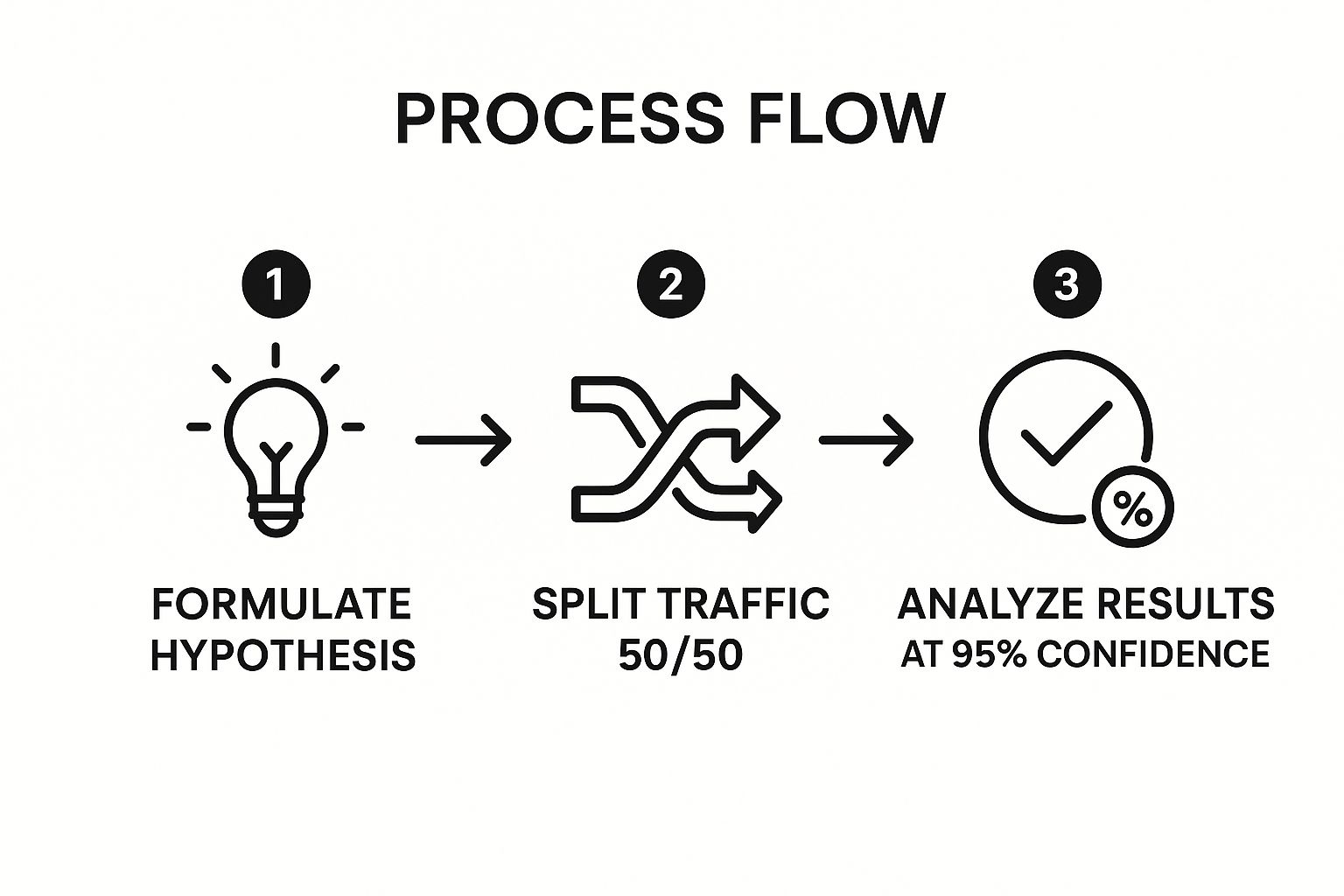
This simple, three-step process ensures your testing is structured, reliable, and leads to clear conclusions about what truly drives conversions.
2. Compelling Call-to-Action (CTA) Optimization
Your call-to-action is arguably the most important element on your page; it's the final gate between a visitor and a conversion. Compelling CTA optimization involves the strategic design, wording, and placement of the buttons and links that prompt users to act. It transforms a passive visitor into an active lead or customer by combining persuasive copy, eye-catching design, and clear direction.
Effective CTAs remove friction and create a sense of urgency or value. For instance, Dropbox famously increased conversions by 60% just by changing its CTA from "Sign up for free" to the more specific and benefit-driven "Try Dropbox Business free." This small change highlights the power of precise, action-oriented language in guiding user behavior and is a core principle of conversion optimization tips.

How to Implement Compelling CTAs
To truly engineer irresistible CTAs, consider the essential question: what makes a good CTA? It comes down to a blend of psychology, design, and clarity. Start by auditing your existing CTAs and testing improvements based on proven principles.
Follow these core strategies for immediate impact:
- Use First-Person Language: Phrasing your CTA from the user's perspective, like "Get My Free Guide" instead of "Download Your Free Guide," creates a stronger sense of ownership and can boost click-through rates.
- Create Urgency: Incorporate time-sensitive language such as "Shop the Sale Now" or "Offer Ends Today" to encourage immediate action and combat decision paralysis.
- Make Them Visually Prominent: Your CTA button should stand out from the rest of the page. Use a contrasting color that draws the eye but still fits your brand palette.
- Be Specific and Action-Oriented: Vague CTAs like "Submit" or "Click Here" are uninspiring. Instead, use descriptive, action-focused text like "Start Your 30-Day Free Trial" or "Reserve Your Seat."
3. Build Confidence with Social Proof and Trust Signals
People are more likely to act when they see others doing it first. This psychological principle, known as social proof, is a powerful conversion optimization tip because it builds credibility and reduces purchase anxiety. By showcasing positive feedback and endorsements from others, you leverage the "wisdom of the crowd" to reassure potential customers that they are making a good decision.
Social proof works by validating a choice. For example, Amazon's customer review system is a core driver of its sales, allowing buyers to make informed decisions based on others' experiences. Similarly, Booking.com creates urgency by showing how many people are currently viewing a hotel, while Slack displays the logos of well-known companies like Target and Uber to instantly establish its credibility. These signals tell new users, "If it's good enough for them, it's good enough for me."
How to Implement Social Proof Effectively
The key is to place these trust signals strategically where users are most likely to hesitate, such as on product pages, at checkout, or near a sign-up form. To learn more about how consumer reviews impact purchasing decisions, platforms like Trustpilot offer deep insights into building customer confidence.
Here are a few core principles for using social proof:
- Be Specific and Authentic: Vague praise is forgettable. Use real testimonials with customer photos and specific details about their results. Instead of "Great product," use "This tool helped us increase leads by 40% in just two months."
- Showcase Recognizable Logos: If you serve well-known brands, display their logos prominently. This "borrowed credibility" instantly elevates your own brand's status and is a common practice among B2B service providers.
- Use Data and Numbers: Quantifiable proof is highly persuasive. Highlighting metrics like "Trusted by over 50,000 users" or "98% customer satisfaction rate" provides concrete evidence of your value and popularity.
4. Optimize Page Load Speed to Retain Visitors
In an age of instant gratification, a slow website is a conversion killer. Page load speed optimization is the technical process of making your website load faster, directly impacting user experience and reducing bounce rates. Even a one-second delay can cause visitors to leave, making this one of the most critical conversion optimization tips for any online business.
The impact of speed is not theoretical; it's a proven revenue driver. For example, Amazon calculated that a mere 100-millisecond delay could cost them 1% in sales. Similarly, Pinterest reduced perceived wait times by 40% and saw a corresponding 15% increase in sign-ups and search engine traffic. These giants prove that investing in speed delivers a tangible return on investment by keeping users engaged and moving them down the funnel.
How to Implement Page Load Speed Optimization
Start by analyzing your site's current performance using free tools like Google's PageSpeed Insights or GTmetrix. These tools provide a detailed report and actionable recommendations. Focus on changes that offer the biggest impact with the least effort first.
Here are a few core principles to follow:
- Optimize Images: Compress images and use next-gen formats like WebP. Large, unoptimized images are one of the most common causes of slow load times.
- Leverage Browser Caching: Instruct browsers to store static files (like your logo, CSS, and JavaScript) locally. This way, repeat visitors don’t have to re-download them every time.
- Minimize HTTP Requests: Each element on a page (images, scripts, stylesheets) requires a separate request. Reduce the number of elements or combine files to speed up loading.
- Enable Lazy Loading: Configure images and videos to load only when they are about to enter the user's viewport. This prioritizes above-the-fold content for a faster initial load.
5. Landing Page Optimization and Focus
Don't send valuable campaign traffic to your homepage and hope for the best. A core conversion optimization tip is to create dedicated landing pages that are laser-focused on a single objective. Unlike a homepage with dozens of links and goals, a landing page removes distractions and guides a visitor toward one specific action, dramatically increasing the likelihood of conversion.
This strategy works because it creates a seamless, relevant user journey. For example, Spotify's dedicated landing pages for its Premium service convert an incredible 30% higher than traffic sent to its homepage. Similarly, Shopify’s free trial landing pages outperform its main site by 200%. These figures prove that when you remove clutter and match the message to the user's intent, conversions skyrocket.
How to Implement Landing Page Optimization Effectively
The key is to create a direct path from your ad or traffic source to the conversion goal. A user clicking an ad for a "20% Off Spring Sale" should arrive on a page that reflects that exact offer, not your general product catalog. For more ideas on creating high-converting sales funnels, exploring how to improve online sales offers a deeper dive into the customer journey.
Here are a few core principles for creating high-performing landing pages:
- Match the Message: The headline on your landing page must precisely match the ad copy that brought the user there. This "message match" reassures visitors they are in the right place.
- Remove Distractions: Eliminate the main navigation menu, footer links, and any other elements that could pull the user away from your primary call-to-action.
- Focus on a Single Goal: Every element on the page, from the copy to the images and the form, should support one conversion action, whether it's signing up, downloading a guide, or making a purchase.
- Keep Forms Simple: Only ask for the absolute essential information needed to complete the conversion. Every extra field you add creates friction and can lower your conversion rate.
6. Mobile-First Conversion Optimization
Don't treat your mobile experience as an afterthought; make it your priority. Mobile-first design is a crucial conversion optimization tip that involves designing for the smallest screen first and then scaling up to desktop. With mobile traffic now surpassing desktop for most websites, a seamless mobile experience isn't just nice to have, it's essential for survival and growth.
This user-centric approach forces you to focus on core functionality and simplify the conversion path, which benefits all users. For example, Domino's now sees over 70% of its digital sales come through mobile, a direct result of its early focus on a frictionless mobile ordering process. Similarly, Pinterest improved its mobile conversion rates by 40% after implementing a mobile-first redesign that prioritized speed and usability.
How to Implement Mobile-First Optimization Effectively
To get started, shift your design process to begin with the mobile view. This means prioritizing touch-friendly elements, fast load times, and streamlined navigation from the very beginning. For businesses looking to master this approach, the principles popularized by mobile design expert Luke Wroblewski offer a foundational guide to building effective mobile experiences.
Here are a few core principles to follow:
- Design for Thumbs: Place key navigation elements and call-to-action buttons within easy reach of a user's thumb. This simple ergonomic consideration dramatically improves usability for one-handed use.
- Minimize Form Fields: Typing on a mobile device is cumbersome. Reduce the number of required fields in your forms to the absolute minimum to decrease friction and abandonment.
- Prioritize Performance: Mobile users are impatient. Compress images, leverage browser caching, and minimize code to ensure your pages load in under three seconds.
- Use Mobile-Specific Features: Integrate mobile payment options like Apple Pay and Google Pay, and use features like click-to-call for phone numbers to make actions effortless for mobile visitors.
7. Personalization and Dynamic Content
Stop treating your audience like a monolith and start speaking to them as individuals. Personalization and dynamic content involve delivering customized experiences, offers, and content based on user data like behavior, location, or past interactions. This strategy is a powerful conversion optimization tip because it makes your website feel instantly more relevant and helpful to each visitor.
This data-informed approach builds a stronger connection, showing users exactly what they are most likely to value. For instance, Amazon attributes up to 35% of its revenue to its famous "People who bought this also bought" recommendation engine. Similarly, Netflix's personalized content suggestions are responsible for driving 80% of what users watch. These examples show how tailoring the user experience directly impacts engagement and revenue.
How to Implement Personalization Effectively
To get started, you don't need a massive data science team. You can begin with simple triggers, like showing a different headline to a returning visitor versus a new one. For those ready to explore more advanced options, discovering the right website personalization tools can equip you with the technology needed to create sophisticated, dynamic experiences.
Here are a few core principles to follow:
- Start with Simple Behavioral Triggers: Greet returning customers by name, show location-specific offers, or display recently viewed items. These small touches make a big difference.
- Use First-Party Data for Accuracy: Leverage data you collect directly from your users, such as purchase history or on-site behavior, to create highly relevant and accurate personalized content.
- Test Personalized vs. Static Content: Always measure the impact. Use A/B testing to compare the performance of a personalized page element against a generic, static version to validate its effectiveness.
8. Form Optimization and Friction Reduction
Every form field you ask a user to fill out is a potential point of friction. Form optimization is a crucial conversion optimization tip because it directly addresses and removes these barriers, making it easier for users to complete sign-ups, checkouts, and inquiries. The core principle is simple: the easier you make it for someone to give you their information, the more likely they are to do it.
This data-backed strategy focuses on streamlining the user experience by asking only for what is absolutely necessary. For example, Expedia famously increased annual profits by $12 million simply by removing one optional field (“Company Name”) from its booking form. Similarly, Marketo increased its conversion rates by 10% by breaking a long, intimidating form into a more approachable multi-step process. These cases highlight how reducing user effort translates directly into significant business gains.
How to Implement Form Optimization Effectively
To get started, audit your existing forms to identify and eliminate any non-essential fields. The goal is to make the process as seamless as possible, from the first click to the final submission. For those looking to dive deeper, the research from pioneers like the Baymard Institute provides extensive data on checkout and form usability.
Here are a few core principles to follow:
- Ask Only for Essential Information: If you don't need a user's phone number to deliver your newsletter, don't ask for it. Every extra field increases the chance of abandonment.
- Use Smart Defaults and Autofill: Pre-fill known information and leverage browser autofill capabilities to save users time and effort. This minimizes the cognitive load required to complete the form.
- Implement Inline Validation: Provide real-time feedback as users fill out the form. A green checkmark for a valid email or an instant red warning for an error is much better than making them wait until they hit “Submit.”
- Show Progress for Multi-Step Forms: If your form is long, break it into logical sections and use a progress bar. This manages user expectations and makes the process feel less daunting, a technique popularized by platforms like Typeform.
Conversion Optimization Tips Comparison
| Item | Implementation Complexity | Resource Requirements | Expected Outcomes | Ideal Use Cases | Key Advantages |
|---|---|---|---|---|---|
| A/B Testing and Multivariate Testing | Medium to High | Significant traffic, analytics | Data-driven decisions, improved conversions | Website/email optimization, major changes | Quantifiable results, risk reduction |
| Compelling Call-to-Action (CTA) Optimization | Low | Minimal design and copywriting | Immediate conversion rate impact | Button/link optimization across digital channels | Low cost, easy to test and iterate |
| Social Proof and Trust Signals | Low to Medium | Gathering genuine reviews, content updates | Increased credibility, reduced hesitation | E-commerce, service trust-building | Builds trust, low cost, psychological leverage |
| Page Load Speed Optimization | Medium to High | Technical expertise, monitoring | Improved UX, higher conversions, better SEO | All websites, especially mobile-heavy | Better user experience, SEO boost |
| Landing Page Optimization and Focus | Medium | Design and development resources | Higher focused conversion rates | Campaign-specific pages, paid ads | Clear messaging, better tracking |
| Mobile-First Conversion Optimization | Medium to High | Mobile design/testing expertise | Increased mobile conversions, better UX | Mobile-heavy traffic sites | Future-proofing, better rankings |
| Personalization and Dynamic Content | High | Data infrastructure, development | Higher engagement and conversions | Personalized marketing, e-commerce | Increased relevance, customer lifetime value |
| Form Optimization and Friction Reduction | Medium | UX/UI design, testing | Reduced abandonment, better lead quality | Forms and checkout processes | Faster conversions, better UX |
Start Converting More Visitors Today
Boosting your website's conversion rate isn't the result of a single, monumental change. Instead, it's a strategic process built on a foundation of continuous, data-informed improvement. Throughout this guide, we've explored a powerful toolkit of conversion optimization tips designed to transform your digital presence from a passive brochure into an active, high-performing asset for your business. The journey to a higher conversion rate is not about finding a magic bullet; it's about a commitment to understanding your users and systematically removing the friction they encounter.
From Insights to Action: Your Path Forward
We've covered a wide range of strategies, each targeting a critical part of the user journey. From the analytical rigor of A/B testing and the psychological pull of compelling CTAs to the trust-building power of social proof, every tip is a lever you can pull to influence user behavior positively. You learned the technical necessity of optimizing page load speed and the strategic importance of creating focused, distraction-free landing pages. The core theme connecting all these tactics is simple: empathy for the user. When you prioritize their experience, conversions will follow.
Remember that modern conversion optimization is not a static checklist. It is a dynamic and iterative process. The key takeaways from our discussion should form the pillars of your ongoing strategy:
- Test Everything, Assume Nothing: Never rely on gut feelings alone. Use A/B and multivariate testing to validate your ideas with real user data. Every element, from a headline to a button color, is a testable hypothesis.
- Clarity Over Cleverness: Your calls-to-action, forms, and value propositions must be instantly understandable. Ambiguity is the enemy of conversion. Make the next step obvious and effortless for your visitors.
- Trust is Your Most Valuable Currency: Use social proof, security badges, and transparent policies to build credibility. A visitor who trusts you is far more likely to convert into a customer.
- Personalization is the New Standard: In a crowded digital landscape, generic experiences get ignored. Leverage dynamic content and user data to create tailored journeys that make each visitor feel understood and valued.
Start Small, Win Big
The sheer number of potential optimizations can feel overwhelming, but the most effective approach is to start small. Don't try to overhaul your entire website at once. Instead, pick one high-impact area from this list, such as optimizing your highest-traffic landing page or simplifying your checkout form. Formulate a clear hypothesis, launch a single test, and measure the results. Each test, whether it succeeds or fails, provides invaluable insight into your audience's behavior. This collection of conversion optimization tips is your roadmap. The journey begins with that first, deliberate step. What will yours be?
Ready to supercharge your personalization and reduce friction with intelligent automation? Discover how Yoonoo's AI-powered chatbots can engage visitors in real-time, answer their questions instantly, and guide them toward conversion 24/7. Start your free trial at Yoonoo and see how effortless optimization can be.